Story Of God’s Design
This is a sharing on how this project’s name and logo came about.
- During an announcement in church, an indistinct rainbow cross embroidered on the sleeve of a guest speaker on the announcement slide popped into the designer’s mind with a message “Multi-colored Cross”.
- And the “Multi-colored Cross” message was followed by a second vision of diamond like multi-faceted texture with lights and brilliance. But the designer still processing the first vision was thinking of simple multi-colored stripes or square-shaped texture and brushed the second vision off as her own imagination.
- God reinforced the second “Lights and Brilliance” vision through Cynthia’s (co-founder) message of “light shining on the cross”. Cynthia received a vision while reading the designer’s experience via text messages and shared what she saw. Though Cynthia had a different vision but with that particular message the designer knew exactly what it meant and the affirmation needed for the design.
- God wanted “Loving God & One Another” inline with base of cross as it symbolizes His foundation teaching and was adamant on leaving it there when the designer wanted to position it lower as with most standard slogans and taglines layout. And this would have broken the hidden meaning of this logo (ref #6).
- God wanted to endorse this project with Jesus signing-off, Praise the Lord!
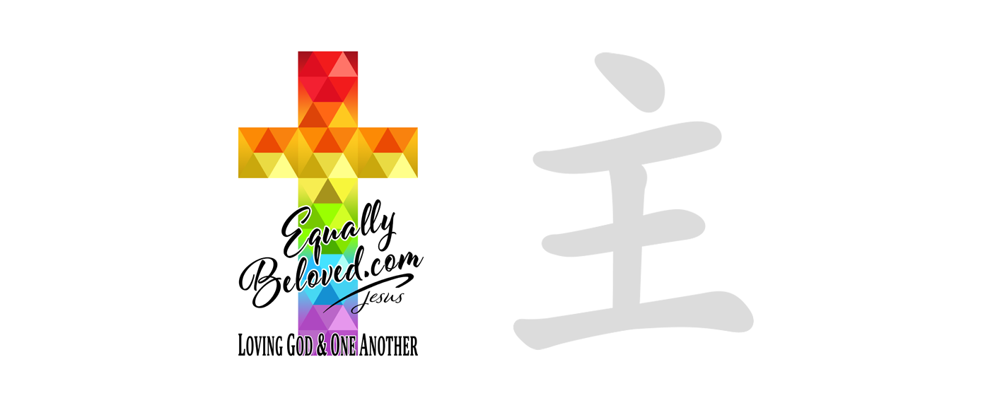
- When the designer started to have thoughts of resizing the cross (feeling that it was too big), God wanted the design to remain as is and said “Hold on, see this” and stroke by stroke He drew the word “主” (Lord in Chinese) onto the logo to show the designer. The first word the designer saw was “土” (earth in Chinese) and when God completed the last center stroke the designer was in awe and even Googled to reconfirm the word.
- The website/project name was God’s will too. While brainstorming for website names, God prompted the designer, “someone will say ___beloved.com, use that”. And the next name that came up was “Equally Beloved” suggested by Pastor Pauline! No further name was asked.
Pastor Pauline’s sharing: “It’s interesting what you shared about ___beloved.com because when Shen was asking about whether the website name should have something related to gay or Christian, I asked myself what would the main question people would have in their mind when they are looking for a site like this. My first thought was “stillbeloved” but that is already taken. I also thought of “justasbeloved”. Then as I thought more, I realized that for both straight and LGBTQ Christians, we all need to be able to affirm that we are Equally Beloved in God’s eyes. Anyway, just thought I would share :)”
The facets represent a multi-facet God with all His brilliance and diversity. His spectrum (colors) of Love and Light shining and reflecting on individual hearts and souls (facets); and how every facet is also intricately a part of the Whole, the interconnectedness of His breath and light.
Reason of this sharing is to declare God’s glory and how He orchestrated the whole process. God was patient and concise. Our God is a living God, one who is always present and constantly assuring that we are never alone and all are Equally Beloved. All love and praise to Him!
Faithfully His.
“There is neither Jew nor Greek, there is neither slave nor free, there is no male and female, for you are all one in Christ Jesus.” ~ Galatians 3:28


